The AI Typography Bottleneck
For years, getting artificial intelligence to spell words correctly inside an image was a running joke across the generative art community. You could generate breathtaking photorealistic portraits, intricate sci-fi landscapes, or hyper-detailed architectural renders, but the moment you asked the model to write a simple word like “OPEN” on a storefront sign, everything fell apart. The AI would output alien glyphs, scrambled lettering, and nightmare-fuel alphabets that looked like pseudo-Latin translated through a broken lens.
Legacy architectures struggled with typography because their text encoders (like CLIP) were built to understand overall semantic concepts rather than individual character geometry. When Flux.1 was released by Black Forest Labs, it completely revolutionized the generative landscape. By incorporating a massive T5-XXL text encoder and a transformer-based diffusion architecture (DiT), Flux.1 suddenly demonstrated an astonishing native ability to spell words correctly.
However, native text rendering came with its own set of limitations. While Flux.1 can spell single words out of the box, it often struggles when you demand precise typographic placement, custom brand fonts, complex multi-line layouts, or strict graphic design alignment.
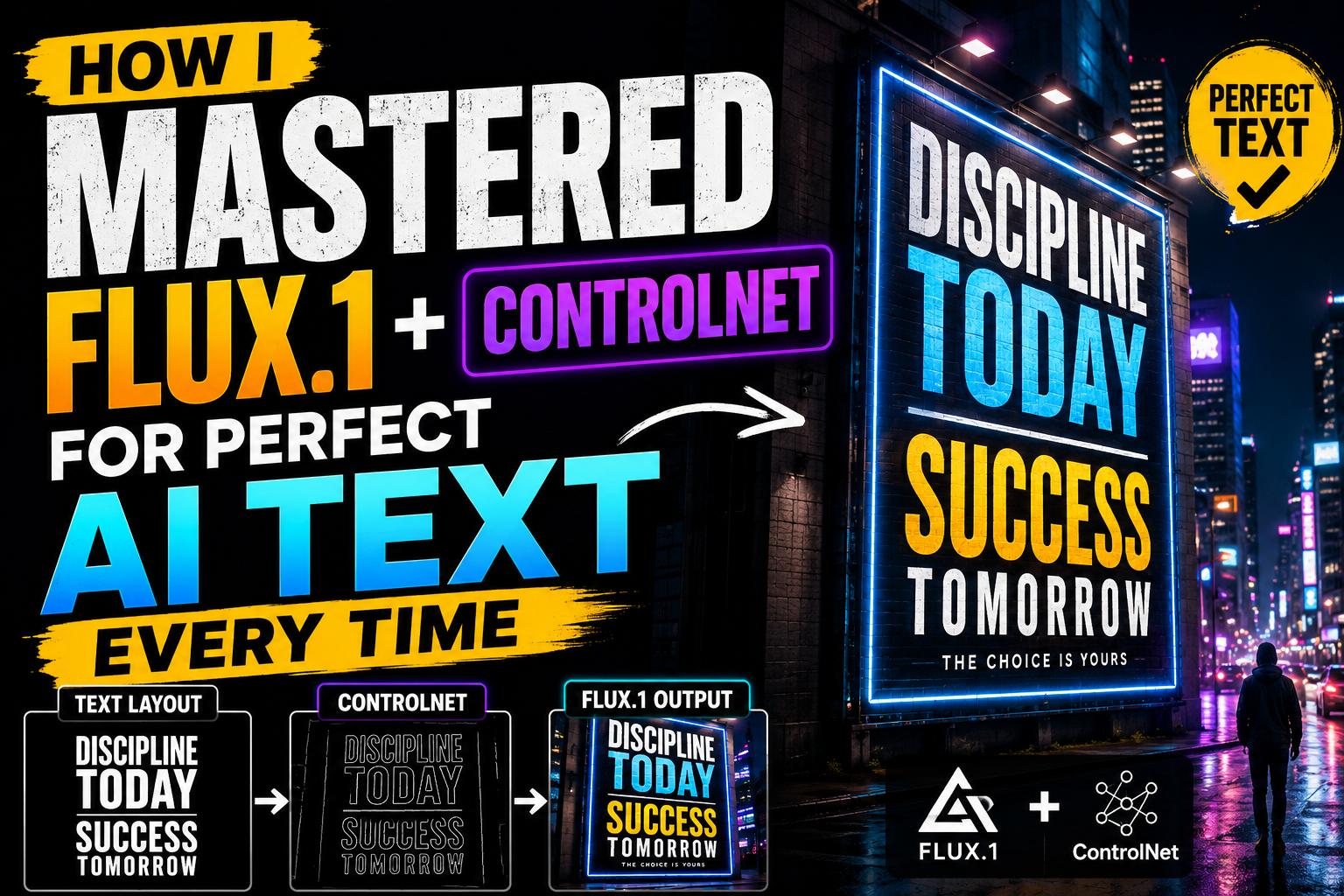
That was the exact challenge I set out to solve. By combining the unmatched generative intelligence of Flux.1 with the structural rigidity of ControlNet, I built a bulletproof production pipeline that renders 100% accurate, beautifully stylized typography embedded natively into complex scenes every single time. Here is how I did it.

Why Native Flux.1 Rendering Still Needs Structural Guidance
To master AI text, you first have to understand the difference between spelling and layout design.
When you prompt Flux.1 with a phrase like a retro neon sign that says "LATE NIGHT DINES", the model draws on its internal T5-XXL language weights to construct the letters. But because the latent space is inherently fluid, the model makes arbitrary creative choices:
-
It might place “LATE” on top of “NIGHT” instead of side-by-side.
-
It might curve the lettering in a way that disrupts the horizon line.
-
It might pick a generic font style that fails to match your art direction.
-
In longer sentences, it might still drop a letter or hallucinate extra kerning spaces.
When you are creating commercial assets—such as book covers, product packaging mockups, event posters, or brand logos—”almost correct” isn’t good enough. You need absolute pixel-level structural authority over where the letters sit, how big they are, and how they interact with scene lighting. This is where ControlNet enters the equation.
The Secret Weapon: Marrying Flux.1 with ControlNet
ControlNet acts as a structural overlay that guides the diffusion process. Instead of letting the AI guess where shapes belong, ControlNet feeds a structural map—such as a Canny edge detection outline or a depth map—directly into the sampling loop alongside your text prompt.
By pairing a custom high-contrast typographic skeleton with a Flux.1 Canny or Depth ControlNet node, you effectively decouple structure from aesthetics:
-
The Typography Skeleton (Control Map): Dictates the exact font, size, kerning, alignment, and placement of every character.
-
Flux.1 Base Model: Handles the lighting, textures, shading, materials, and organic integration into the surrounding environment.
The result is typography that looks completely natural—reflecting neon light onto wet pavement, casting dynamic shadows across textured brick walls, or etching seamlessly into weathered wood—without a single misspelled letter or warped curve.
My Step-by-Step Production Blueprint
Here is the exact step-by-step workflow I use to produce perfect, production-ready AI text renderings.
Step 1: Designing the Layout Skeleton
I never rely on the AI to guess font styles or composition. I take direct control of the typographic skeleton right at the start.
-
Open a graphic design tool like Photoshop, Figma, or Canva.
-
Set up a canvas matching your target image aspect ratio (e.g.,
1024x1024or1280x720). -
Create a pitch-black background (
#000000). -
Using solid white text (
#FFFFFF), type out your exact phrase. Choose your desired font family, line spacing, and alignment. -
Export this file as a high-contrast PNG. This black-and-white graphic serves as your master ControlNet layout skeleton.
Pro-Tip: Ensure your text contrast is sharp. Crisp edges in your layout skeleton translate directly into clean, sharp character geometry during the diffusion process.
Step 2: Wiring Up the ComfyUI Pipeline
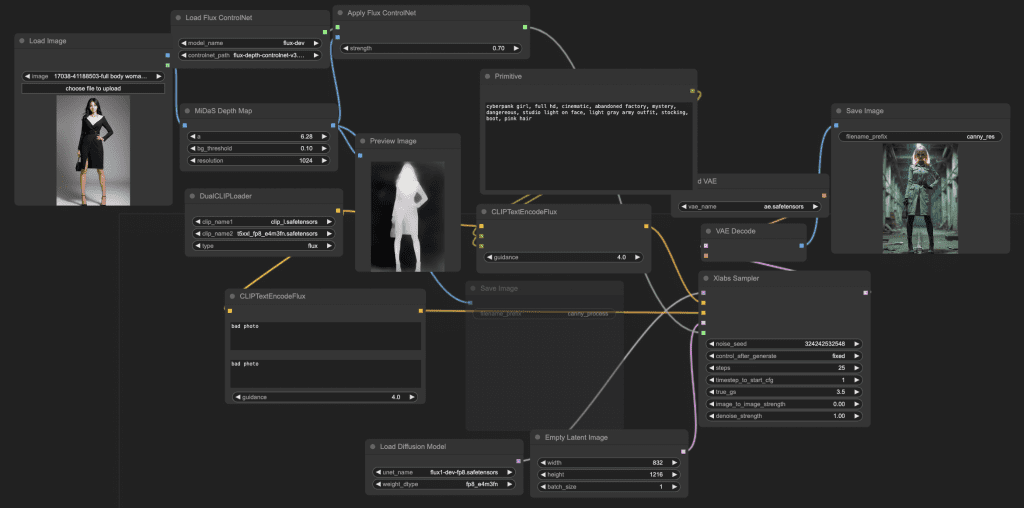
While you can run basic ControlNet workflows in various web interfaces, ComfyUI offers the granular control necessary for high-end rendering. My master workflow relies on the following node structure:
-
DualCLIPLoader / UNETLoader: Loads the Flux.1 Dev or Schnell checkpoint alongside the CLIP-L and T5-XXL text encoders.
-
Load Image Node: Imports the black-and-white typographic skeleton generated in Step 1.
-
Apply ControlNet Node (Flux Union / Canny): Connects the typographic skeleton image into the sampling chain.
-
KSampler: Executes the denoising steps, balancing prompt conditioning with ControlNet structural guidance.
[ Layout Skeleton (PNG) ] ──> [ Apply ControlNet Node ] ──┐
                                                           ├──> [ KSampler ] ──> [ VAE Decode ] ──> [ Final Image ]
[ Flux.1 Checkpoint + T5 ] ──> [ CLIP Text Encode ] ───────┘
Step 3: Prompt Engineering and Weight Balancing
The real art of mastering this setup lies in tuning your ControlNet weights and writing synergistic prompts. If your control strength is set too high, the output will look like a flat 2D graphic pasted on top of an image. If it is too low, Flux.1 will ignore your layout skeleton and revert to its own arbitrary text rendering.
-
Setting Control Weight: I set my ControlNet weight between
0.80and0.85. This represents the golden ratio—strong enough to enforce exact letterforms and kerning, but low enough to allow Flux.1 to wrap light, shadow, and texture around the letters naturally. -
Prompt Formulation: Your text prompt must explicitly describe both the typography and its surrounding environment, while reinforcing the text string in quotation marks.
Example Prompt Structure: “A cinematic wide shot of a vintage 1950s diner at night in the pouring rain. Mounted on the brick facade is a glowing neon sign displaying the exact text ‘OPEN LATE’ in vibrant cyan glass tubing. Wet asphalt reflecting blue neon light, cinematic lighting, shallow depth of field, photorealistic 8k.”
Step 4: Surgical Refinement with Inpainting
Even with an optimized ControlNet setup, complex serif fonts or long sentences may occasionally feature a minor artifact, such as a slightly thick crossbar on an “A” or a minor smudge on an “S”.
Rather than re-rendering the entire scene from scratch, I fix minor imperfections using targeted inpainting (or Flux.1 Fill):
-
Load the generated image into an inpainting editor.
-
Draw a tight mask exclusively over the single letter or character that needs adjustment.
-
Lower your denoise strength to
0.30–0.35. -
Re-run the prompt targeting just that specific word inside quotation marks (e.g.,
The letter "E" in bright neon tubing).
Because the denoise is low, the model preserves the surrounding lighting and atmosphere while cleanly rebuilding the masked letterforms.
Real-World Applications: Where This Workflow Shines
Mastering this pipeline opens up commercial visual possibilities that were previously impossible with generative AI:
Key Takeaways and Best Practices
To summarize my approach for consistently flawless AI text rendering:
-
Always start outside the AI: Design your text layout in Figma or Photoshop first to establish 100% control over typography.
-
Match canvas dimensions: Ensure your black-and-white skeleton aspect ratio matches your diffusion latent dimensions perfectly to prevent stretching.
-
Keep Control Weights near
0.80–0.85: This strikes the ideal balance between structural adherence and natural scene blending. -
Reinforce quotes in prompts: Always enclose your target text in quotation marks inside your prompt to help the T5-XXL encoder align text intention with visual structure.
-
Inpaint surgically: Fix micro-glitches with low-denoise inpainting rather than rolling the dice on full scene regenerations.
By bridging precise graphical layout design with the raw rendering power of Flux.1, you can eliminate the randomness of AI typography entirely. The result is a fast, predictable, and professional pipeline that yields perfect text renderings on every single run.